HOME
BACK
ABOUT ME
PROCESSING
CONDITIONAL DESIGN
RESEARCH
This is a simple brainstorm of what I might want to do for the final. At the beginning I wanted to create an app that allows people to dress up their own character. This would have included current trends that is going in at this current time. It would have also also allowed the player to purchase the outfit that they had just created via the app.But I soon found that a very simple thing to do and I wanted to challenge myself furthermore.
So I then went for my second idea and that was to create an app for student to help them play a game so that they can increase their knowledge. This initial idea came from when I was at home looking at how to do something for a project in a different module. In then came to my idea that why not put two and two together to create a app/game for student who want to learn in a more interactive way.
So for my final project, I will be designing (concept) a app for students to learn coding and Adobe in an interactive form. The app will be aimed at 16+. The reason why I have chosen this particular age range was because from experience, I started to use code and Adobe in college and I wanted to put my own experience into it. So the final result of the app should be a Learn and Play app.
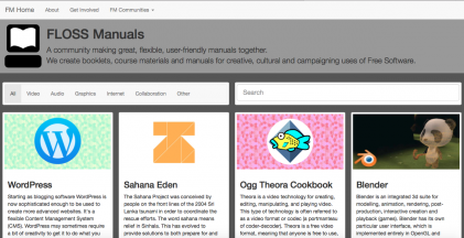
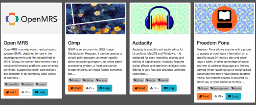
For research, I found a website called flossmanuals.net. On this website there was a lot of useful information that I had taken in. It was basically a website to help people to understand certain program. There a few programs that I am familiar with on the website and I wanted to look at them to see what information they offer.
CLICK ON THIS LINK TO SEE THE WEBSITE IN MORE DEAPTH http://www.flossmanuals.net
As soon as I went onto the website, I noticed a program that I currently use and this program is called BLENDER. I use blender for another module that I do and I wanted to look at how the information has been given and how it had been set up. I like how there is an introduction about the program. I looked further into the information that was given and it then took me to this page called "RENDERING". This page showed me as a user how to render something that I would have made in blender. From looking at this website, I want to take into account that I want to include information about the program. I have also gathered that I don't want the app to be filled with text because I want it to be more interactive and more simple for the user to use.

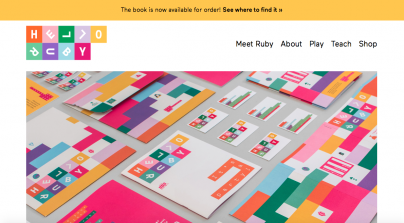
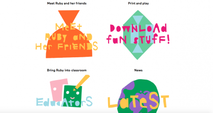
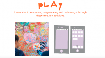

I then went onto looking at this website called "HELLO RUBY". Hello Ruby is a learn and play game/interaction for young kids so that they can understand programming in a fun and creative way. Looking at this website made me understand in better depth of what I wanted to do. I wanted to do the exact dame but in app form and also with a target audience of 16 year old people and above. The first thing that I need to do is come up with a logo so that the audience knows what this app is going to be about and so that they can identify the app.
FLOSS MANUALS
FLOSS MANUALS - BLENDER
HELLO RUBY
HONESTLY HAVE A LOOK AT THE WEBSITE AND CLICK ON THE LINK:
http://www.helloruby.com
Here's a better understand of what Hello Ruby is all about, watch these kids talk about what they have learnt?
LOGO DESIGN
This is my brainstorm for my logo design. I want my logo design to be slick and clean so that the user knows and can understand what the app may be about. I don't want to the design to be complicated because I feel like this may sent off an impression to the user that this may be a complicated design and that defiantly something that I don't want to do.
I HAVE DECIDED THAT MY APP IS GOING TO BE CALLED TFS. WHAT TFS STANDS FOR IS TECH FOR STUDENTS. I DECIDED TO CHOOSE THIS NAME FOR MY APP BECAUSE WHAT THE NAME OF THE APP IS, IS WHAT THE APP IS GOING TO DO.
BRAINSTORM IDEAS
APP DESIGN IDEA
The first image is a drawing that I made before I scanned it into the computer. This was how I wanted my interface to be, I wanted a simple vector drawing of a computer on a bright background, something simple and something eye catching. I then took this image into illustrator and started to draw the outline with a pen tool. I then took this image into photoshop and started to work with what colour I wanted to use. This was where my design began. I could finally see it come all together.
INITIAL DESIGN
USING ILLUSTRATOR
USING PHOTOSHOP TO CREATE INTERFACE
DESIGNING MY APP- SKETCHES
DESIGN 1
DESIGN 2
DESIGN 3
THIS IS HOW MY FINAL APP INTERFACE DESIGN LOOKS LIKE AND IM HAPPY WITH HOW IT TURNED OUT, IT LOOKS LIKE EXACTLY HOW I WANTED IT TO BE.
These are my design concepts that I drew out by hand. I want to create an app for the recent new iPhone 7. I want the app to be simple so that it can be easily accessible. I also want to create the game so that you can enjoy it on the go and you wouldn't have to be just in one place.
MY FINAL OUTCOME
THIS IS HOW THE APP LOOKS ON THE PHONE
THIS IS HOW THE APP LOOKS WHEN YOU LOAD THE APP
HOW THE LOADING WILL APPEAR
HOW TO SET UP AN ACCOUNT
HOW TO SET UP AN ACCOUNT WITH MOVING TEXT
INTRODUCTION PAGE
A CONTENTS PAGE (LIST COULD GO FURTHER DOWN)
MOVING ARROWS ON THE APP
A "TO DO LIST" OF ALL THE THINGS YOU LEARN ON E.G PHOTOSHOP
MOVING TEXT ON PHOTOSHOP PAGE
BREAKDOWN LIST OF ALL THE THINGS THAT YOU HAVE LEARNT ON THIS TOPIC
QUESTION AND ANSWER PAGE ON THE TOPIC
MOVING TEXT ON THE RECAP Q&A PAGE
RESULTS FROM THE Q&A
STARS ARE MOVING TO INDICATE HOW MANY STARS YOU GOT
OVERALL
Overall, creating this app has made me realise a lot of things, and that is that education is important. From my research I found out that here's a lot of apps to learn many other topics but there really isn't a big platform for design in the app world. For the design on my app, I wanted to choose mutual colours to represent the mood of the app and so that the user gets more engaged to the colours. Originally, I wanted to go for a blue colour theme but I took into account that there's many apps with this particular colour. I then chose the colour green instead because I felt like it set a tone to the app. I use the colour grey as the majority of the text and reason for this is because I didn't want to have an overpowering colour taking over the green. The contrast wouldn't just be there. As for a whole, I am extremely happy with the way that the app concept turned out. It does what I wanted the app to do. To engage students of any age to get creative with the new way of learning.
HTML
LECTURES
ESSAY